
There are many ways to visualize and plan your project progress and track your team goals. Some variants are particularly suitable for projects of a certain size, others for certain types. In this article, we will introduce you to the different solutions and the related tasks you can work with.
Are you looking for software that helps you to visualize the progress of your project?
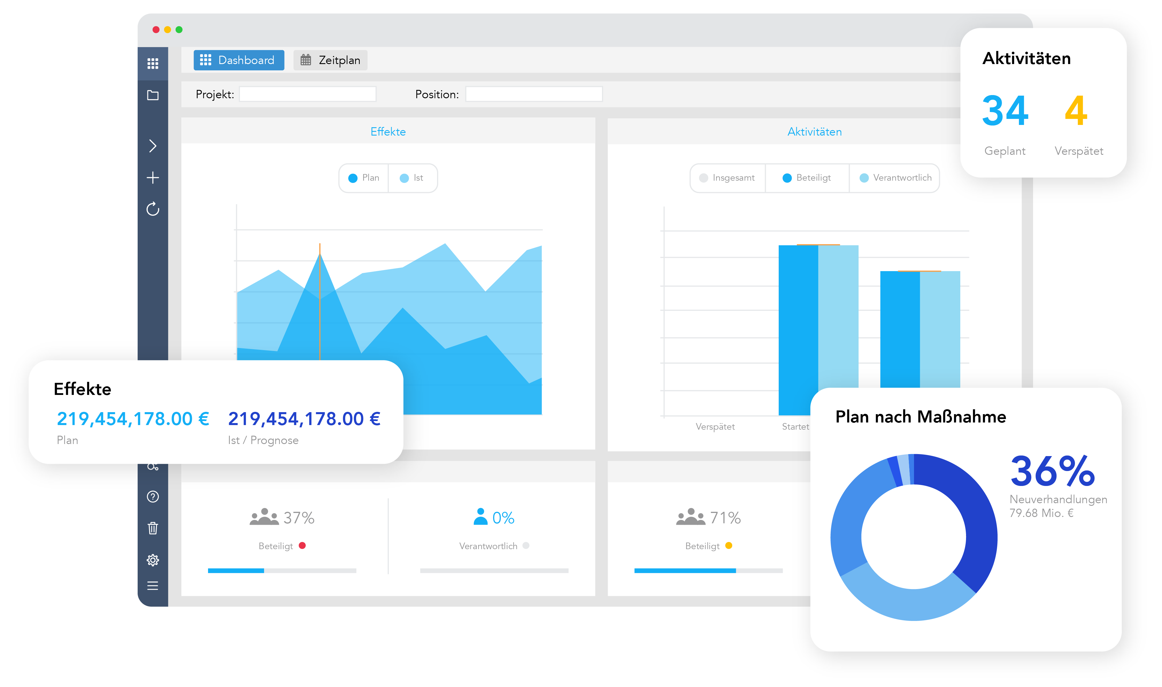
Then Falcon is exactly the software you have been looking for!
1. Gantt-Charts
A Gantt chart, also known as a bar chart, is a project management instrument that allows you to graphically create and plan the chronological sequence of activities in the form of bars, representing the start date, the term and end date. For compact and less complex projects, Gantt charts can be useful to maintain a chronological overview. For large projects with many employees and different teams, the Gantt chart can become too extensive and chaotic. That’s the reason why Gantt charts don’t play a decisive role in Falcon and we recommend other suitable tools to work with, such as PPM tools.
2. Burn-Up-Chart
The burn up chart is a line chart or plane diagram. This gives you and your team an overview of how many tasks have already been completed, what needs to be done and what the current progress is. The diagram is very adaptable and considers changes in application. For this reason, the burn up chart is suitable for controlling the entire project. The burn-up diagram is very useful when the project is not finished and you want to create further changes.

3. Kanban
Kanban has become very popular in the last decades. The method was developed at Toyota, but afterwards it was mainly used by software developers.Thanks to its great advantages, Kanban got used in various areas of the company to create different projects and make work more efficiently. The visual overview is another reason why companies choose to work with Kanban.
The simplest Kanban board is divided into three slots: "To do", "In progress" and "Done". Additional slots can be added if required. The various tasks move through the workflow afterwards. The visualization of the workflow ensures clarity. Moreover, this can help you with task tracking and makes shortages and problems noticeable. The advantage of Kanban is that it can be easily implemented in any project and that it adjusts to individual needs. Therefore, no extensive changes are necessary. This makes Kanban particularly useful for parallel work, as it is common in resources nowadays.

4. Charts with aggregation
The simple table is often used for many tasks. The project status and activities can be defined there. This makes it easy to track the project status, deadlines, priorities and who is responsible for which project. The table can be adapted to the current project status with just a few clicks. Moreover, it can be used by multiple users, which the Gantt chart cannot provide. For structuring projects at different levels, the aggregation from the bottom to higher levels is a helpful tool of maintaining an overview and distributing tasks. This helps to track the progress of individual project parts and to examine the source if necessary. This makes it easier to develop a plan and set goals you want to achieve with your team in the shortest time possible.
5. Status reports and dashboards
Gantt charts and Kanban are good tools for tracking your projects and plan your goals. If you want to communicate your progress or other knowledge with a client, your project sponsor or other team members, a clear status report is the best choice. In addition to that, a real-time dashboard can help you to record the current status of your project from different views and give the team an overview. With the right PPM software, status reports of your team and dashboards can be created with just a few mouse clicks, saving you not only valuable time, but also energy.
Conclusion
Which progress visualization option is the best choice for your projects depends on the type of project and the respective size, tasks, and goals. Under all circumstances, you should use a PPM software that can help you to generate the visualizations automatically. To avoid chaos, it's better to stay away from project portfolio management with Excel. For transformation progress and other strategy tasks, we recommend that you and your team should use charts with aggregation in conjunction with status reports and dashboards! This mix helps you to maintain the best possible overview of complex projects. That's why these options are standard in our PPM software Falcon, and you can create this setting in a few minutes only. Get to know Falcon and the benefits for your project management.
Do you already know about our software Falcon?
Our software Falcon supports you with the planning, implementation and monitoring of your strategy & transformation initiatives. Create clear responsibilities in your team and get a simple and digital overview of the entire project, objectives, and development. This saves you lots of time in planning and organization. Your team members will find the important information in one place and can finally concentrate on their tasks.
Would you like to find out more?
Click on the following link to get all the relevant information about Falcon. You also have the opportunity to schedule a demo call with us. In the call, we will take a detailed look at Falcon and talk about the possible ways of application in your company.
Get to know more about Falcon and check out our resources to plan your project and team goals!