
If measures are to be developed, it is often helpful to take a look at the basic data - and an exploitative analysis can help you to look through them. We take a look at Walmart's sales data and show you how you can proceed!
We're looking at Walmart's sales data.
We have already dealt with measures in several posts.
Basic tenor: Pack the problem at the root and go.
But apparently, we have assumed tacitly that the problem situation and cause is known. To be honest, we also know that this is not the case. But what can be done if you only know that something is wrong, but not really exactly, and why at all? Often a look at the basic data helps in these situations, and we want to show you how you can proceed!
As an example we dedicate ourselves to the mother of all problems: Can we increase sales? We have chosen historical sales data from Walmart - simply because they are publicly available (on Kaggle ... more on this later in another post).
What kind of data are we dealing with?
Walmart provides us with weekly sales figures for 45 stores over three years. Wait...that's 45 stores times 3 years times approx. 52 weeks... well, it'll fit, let's go Excel. Oh... that's a bit too much. Because Walmart delivers us the sales split by departments in the stores. Oh man, and it's not really week-based either...rather day-based...but somehow not every day.
Quite a mess. Welcome to real life. Result: For the first store there are already more than 10,000 data points - and in total more than 400,000... By now at the latest, some people may be calling for controlling and/or wondering why Excel is so damn slow.
What to do if Excel doesn't help anymore?
Many Excel power users might split the dataset and use multiple files. But this is expensive and error-prone. Now you can't demand that everyone has the time to learn things like Python or R. However, there is enough software that can cope with larger amounts of data and where you can draw some conclusions by click-and-point (e.g. Tableau and Stata ).
Data mess? Build and visualize main roads!
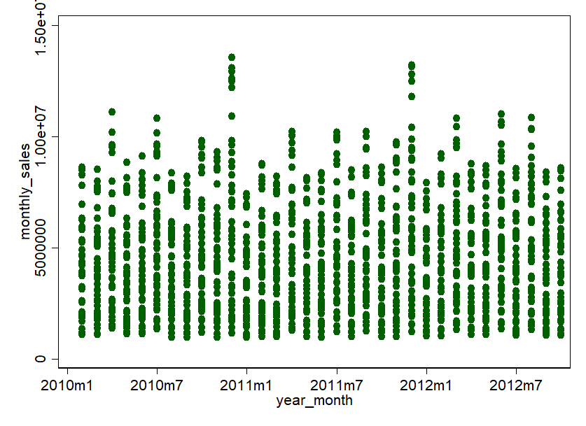
In such cases, the "main road" principle applies first. So, do without details and start one or two levels before. So we aggregate our Walmart data to months and to stores. Departments, weeks and days can also be viewed later. To get a feeling for the data, a visualization is usually the first step. How about this: a scatterplot of the monthly turnover per store over time.
Relativize as much as you can!
Beautiful graphics. Somehow everything is relatively full, but it also allows conclusions to be drawn. Apparently, there are some stores that achieve very high sales in a few months: 600,000 US dollars and more! Then there are some stores that are rather in the lower end of the market. One thing is clear, the variance is very large. Therefore, we shouldn't treat all stores the same, but cluster them according to size, or at least relativize them according to sales area.
All right, let's have a look at the monthly turnover according to the size of the stores (here in square feet, ft²):
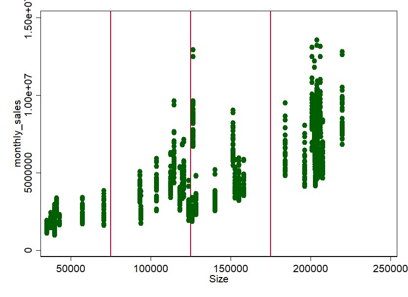
Not surprisingly, there seems to be quite a clear connection. The bigger the store, the more turnover. But does this apply to the whole year? Or are there stores where sales fluctuate over the year? Maybe we should check that out. There is something else that stands out: there seems to be something like groups or "store types". With a bit of eyeballing (the statistician's nightmare) we can, for example, pull rough groups at 75,000 ft², 125,000 ft² and 175,000 ft². This procedure is completely arbitrary. Especially the limit around 125.000 ft² is certainly worth discussing. But that's exactly what it's about: "feeling" into the data without much analysis - you can still do exact analyses afterwards.
Form and compare groups!
So now we have the groups S, M, L and XL. Ok, let's take a look at the store types over time and relativize them to the sales area of the stores. In the sense of relativization, we can also take a look at the stores on average - then you can compare better. Here we go:
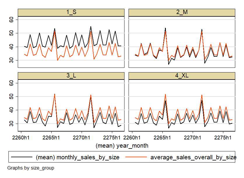
Well, the graphics are certainly not beautiful - but that's not the point here. It's about developing a feel for the data - and we've done that. Because now we know: the business is seasonal. Peaks in March-April, June-July, September-October and November-December. There can be many reasons for this. For example, the weather, or holidays like Labor Day in September, Thanksgiving in November and of course Christmas in December. However, it turns out that the small stores are also seasonal, but somewhat more constant. In addition, the smaller stores seem to generate more turnover per area.
Nevertheless, the pattern is relatively similar for all stores. So for a first analysis, we can more or less lump together all stores for the sake of simplicity.
Examine the course over time!
Now we can finally treat the data for what it actually is: Panel-Data. Data that provide information (e.g. turnover) for an observation unit (the Walmart store) over time. This has enormous advantages. Because we can assume with a high degree of certainty that sales from month to month are not completely independent of each other. They are certainly path-dependent.
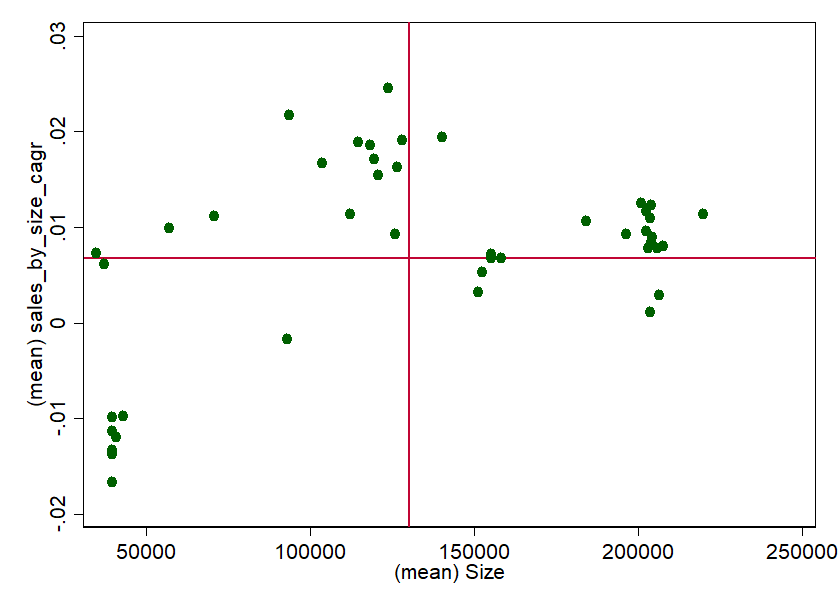
A simple way to get a feel for the performance and path dependency of the stores over time is the growth rate. Since we know that stores have relatively similar patterns during the year, we can use the annual CAGR=0) as an indicator. To get a feel again, we plot the growth rate versus the size. To be able to classify the whole thing better, we add the averages:
Implement knowledge and identify potential measures!
And for the first time, we have already stretched out the feelers in the direction of "measures". Now we could identify why some stores perform so unbelievably well and why some don't (all under CAGR=0). In particular, the smaller stores seem to record negative growth rates despite high space efficiency in the three year period.
But there are also big differences. Since there are so few, one could certainly ask store managers or draw qualitative comparisons (region, competition, product portfolio, average income of customers, etc.). A Like-For-Like-Analysis could also provide further information. Of course, we could also repeat the whole procedure - e.g. for the individual departments or on a weekly basis. Perhaps we would notice something again.
Can this procedure also help you?
In a very short time we were able to get a first impression of Walmart's stores - despite the rather confusing amount of data. The causal relationships are with absolute certainty not quite as simple as described. Stores of similar size and space efficiency are certainly not comparable per se. Regionality, competition, population income density, and many other factors certainly explain much of the high variance. But at least there is now a starting point for a more or less well-founded discussion with colleagues.
We are confident that you now have a feel for Walmart's store concept. Imagine what you could do with this approach and your own sales data! We hope you enjoy it! And should any measures arise and you would like to implement them: Falcon can help you! We like to help! Just ask us via info@nordantech.com.