We love data - and one of the most beautiful manifestations of the data comes with every company: the time series. Today we want to give a brief introduction to time series analyses using the example of corporate insolvencies. As so often in the field of data science, this article is also aimed at readers who want to get a taste of the time series.
Time series
The basic idea is very simple: time series are events that occur at more or less regular intervals, one after the other and therefore over time. So, what is there in a company? Pretty much everything: sales, expenses, production figures...simply everything that occurs over time and repeatedly.
The exciting thing about time series is that they usually contain much more information than you might think at first glance. Things like trends, seasonalities and of course forecasts are of interest. Reason enough to get to the bottom of the time series analysis. The goal for today is to roughly estimate what you can do quickly and easily to get a feel for a time series. We don't want to impart technical skills, but simply show you how to proceed.
Of course, we're working with publicly available data. This time it's about bankruptcies. The data are quite nice, because on the one hand they are halfway continuous and on the other hand you can show when forecast models cause difficulties.
Develop a feeling for the data
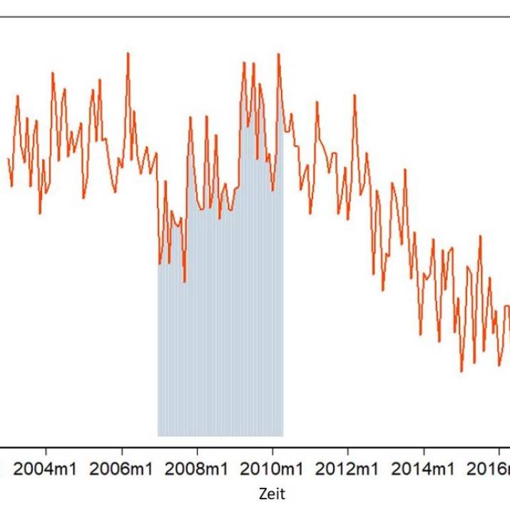
The Federal Statistical Office provides us with monthly data on the insolvency proceedings opened for companies since January 2003. By the way, this is how it looks like in Germany until January 2017:
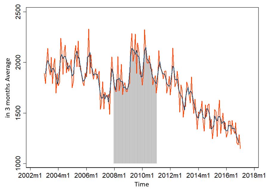
The line in the middle is the 3-month average. But what does this little graph tell us? In total somehow between about 1200 and 2300 insolvency applications. But it shows even more. Maybe that's easier to see if we take a single year out of it:
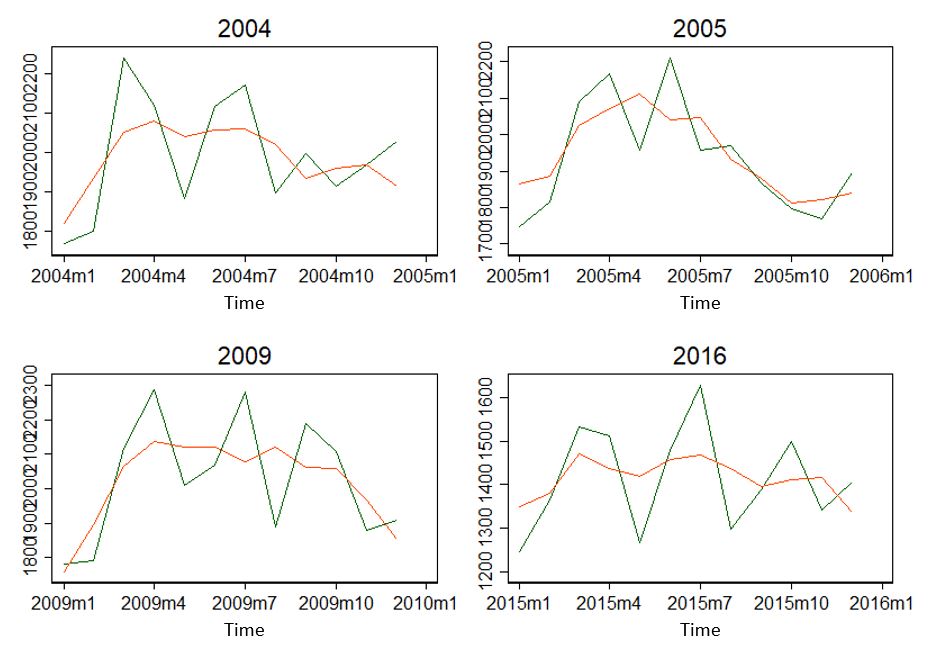
The years seem to be seasonal. Rising to April, then falling, and rising again to June/July? At least the years don't look completely different.
Now we know two things: There seems to be a general trend - or maybe 3? Before 2008/2009, until 2011/12 and afterwards? And seasonal trends - both over the year and over the entire period.
The simplest of all time series analyses: ARIMA
This type of information is easy to process. For this we use a simple time series analysis: the so-called ARIMA method... Autoregressive Integrated Moving Average... Oh man. Again a quite boring definition and description here.
More important than knowing exactly what an ARIMA model does, is to understand when to apply it: namely in situations where mean and variance do not vary over time - i.e. are stationary. Is that the case here? The mean value in 2005 is 1937.25 and the standard deviation is 152.65 companies. In 2009, on the other hand, 2026.25 and 177.46 companies were found.
Without much testing, we can assume that the time series is not stationary - i.e. that the average and variance of the time series is not the same as that of the region. Actually ARIMA does not fit...
However, we can manipulate the data a little. So we can bend it so it looks like it's stationary. Stationary data looks like white noise, so it's more like static flicker. But how do we do that? Now let's be as unscientific as we can. But just fast and above all graphically. No big calculations necessary.
Data transformation
First of all, we try to find out the biggest fluctuations of all. For example, we could logarithmize the time series - because then outliers are less important. A large number is still quite small in the natural logarithm. Looks like it, by the way:
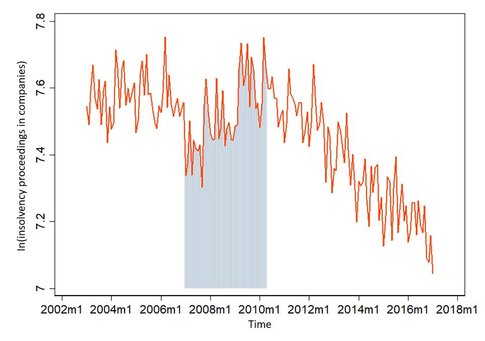
Our maximum of 2329 insolvencies in 2006 has now shrunk to 7.75 (because ln(2329) = 7.75). That looks a bit more like white noise - but everything from about 2010 still has a clear trend. There are even more possibilities. If the logarithmic trick is not enough, it can still be coupled with the First-Order-Difference trick. This means that you form the difference from period to period. That looks like this:
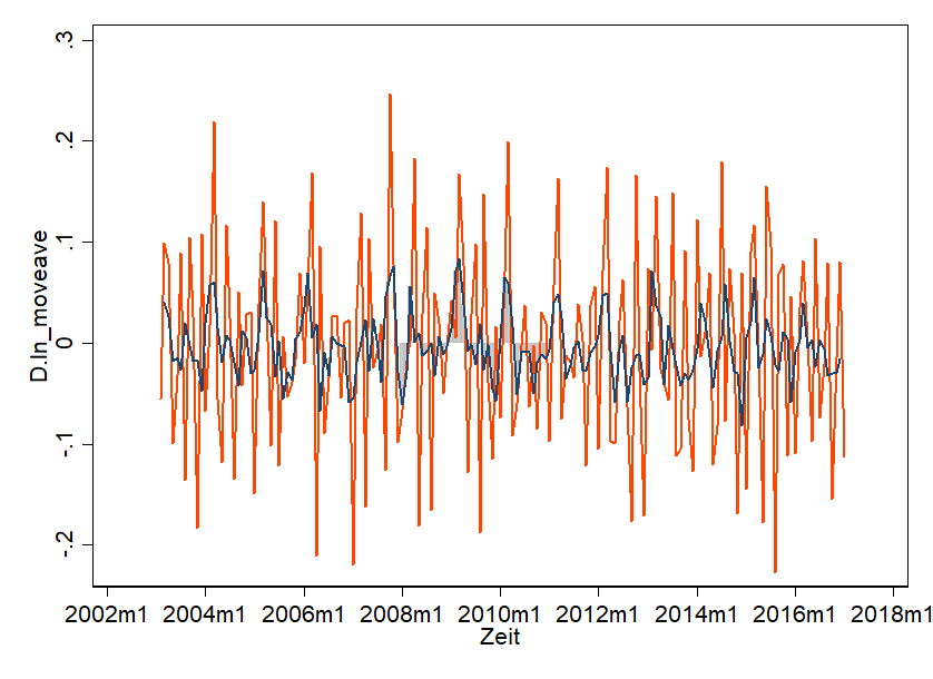
Shown is the First-Order-Difference and in the middle is the average. And that's pretty much what we're looking for! Nice White Noise - so everything looks super similar. Hardly any trend is recognizable. It seems arbitrary. Important here: we didn't "break" the data - we transformed it and can also undo this transformation.
The actual forecast and its problems
Now we can start the ARIMA method. We have to help the ARIMA model a little bit. The "A" in ARIMA stands for "Autoregressive". This means as much as "one period influences another". And ARIMA wants to know from us if this is the case. For this we use a pretty cool graphic - i.e. a correlogram and it looks like this:
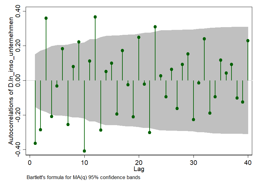
The small needles show us how strongly the time series we observe is connected with itself over time. We use the autocorrelation of one month to the next. The correlation between the number of insolvency applications in the last available month and the previous month is deducted at lag = 1. In our example it is about -0.38 and is also significant - because the needles are outside the grey 95% confidence interval. Cool graphics, huh?
But what do we do with it now: we tell our ARIMA model that at least the first three periods are significantly different from zero in their correlation and ask it to take this into account.
What is the point of all this? We need this information to estimate an ARIMA model with tools like Python, R or Stata. We help these tools price the dependencies over time - and if we do that, we can make forecast statements. That's what it looks like:
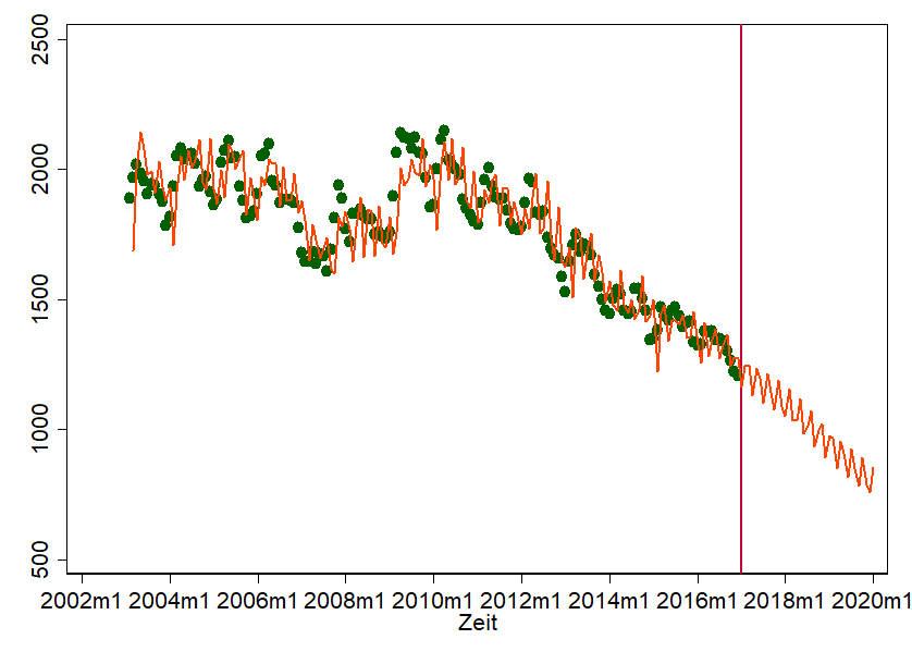
This graph shows a scatter plot of the actual insolvency filings over time. These are the green dots. The line, however, is our prediction model. Of course, this is anything but perfect. But it's not really bad either. We hit some points quite well. We also took the liberty of simply updating the prediction. We think it looks "halfway natural". That's no reason why by mid-2018 there really will be fewer than 1,000 insolvency applications, but it gives us a rough idea of where we're heading.
When can ARIMA be used?
The problem also lies in the simple application of the ARIMA model - and this becomes clear when we pretend to have carried out the same forecast in September 2007 and today compare our forecast with reality:
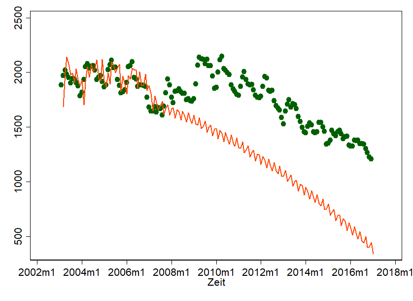
Well, shit happens. The financial crisis has put a spoke in our wheel... and of course our forecast doesn't really look natural anymore. With all the charm that ARIMA brings with it, there is a danger that we will completely lose sight of the underlying processes. ARIMA-Forecasts are therefore particularly meaningful if
- the underlying and determining motives can be well understood and explained - this is often the case, for example, with production data.
- if seasonality and trend can be substantiated by content. This requires quite a lot of data points/periods – starting with 50 it is usually possible. Everything over 100 is better. In most cases, on the other hand, you should always use two to three forecast methods and think carefully about why there are differences.
Do you already have an idea where you could investigate time series in your company? Please let us know. We always welcome feedback!