
Do you know what a Gantt chart is? A Gantt chart is a tool that graphically displays the chronological sequence of activities in the form of bars with start date, duration and end date. All planned tasks are displayed in an overview so that all participants can see which tasks have to be completed by which time. But as good as Gantt diagrams are for some projects, the more problems they cause for most other projects. This article discusses the reason for this!
For Gantt charts, there are some classic applications. However, because of the following drawbacks, caution is advised:
- Gantt charts quickly become confusing, especially for complex projects.
- A linear view makes no sense for many projects
- If you are not working with software, the charts need to be constantly adjusted.
- If multiple people can adjust the charts, chaos is inevitable.
- Especially large project portfolios are hard to read and changes are hard to notice.
Explanations of the individual points and alternatives can be found in this article.
Our experts at Nordantech have created a guide for setting up the project structure and planning activities, milestones and effects.
Where do Gantt charts come from in the first place?
The Gantt chart was invented around 1890 by Karol Adamiecki, a Polish engineer who operated a steel mill in southern Poland. A short time later, the Gantt diagram was first used by Hermann Schürch (1881-1957) for construction projects.
What are Gantt charts?
A Gantt chart is a project management tool that graphically displays the chronological sequence of activities in the form of bars with start date, duration and end date.
About 15 years after Adamiecki, the American mechanical engineer and management consultant Henry L. Gantt adapted the idea and gave the diagram its name. Since then Gantt diagrams have been commonly used in project management. They are considered to be an effective method to display activities (tasks and events) ... and they also have some advantages.
What are the advantages?
Gantt diagrams are particularly well suited for the sequential and parallel display of progress in a project. They provide a good graphical overview and quick orientation for small to medium-sized projects. The duration of individual activities is easily recognizable as long as it does not exceed a certain length. In itself, the Gantt chart is easy to understand and the procedure is very intuitive. However, this only applies to projects that are easy to understand per se and in which the tasks follow one another step by step. This may be the case for engineering projects - but it is not the case for most other project portfolios.
What are the disadvantages?
As good as Gantt diagrams are for smaller projects, the less suitable they are for visualizing complicated projects. There are several reasons for this:
1. Complexity
In large project portfolios with many employees and different teams involved, the Gantt chart can quickly become too large. The presentation of hundreds of tasks of different lengths, for example, is too complicated and difficult to understand. This makes it difficult to record all tasks and resources in larger projects with Gantt charts.
The representability is therefore limited for many operations and the Gantt chart is only helpful for small to medium-sized projects, with no more than 30 activities.
Is your project portfolio complex, and are you struggling to select the right projects? To ensure that the project portfolio is aligned with the overall strategy, this article provides key guidelines for PMO members: read blog article
2. Linearity
In order to use Gantt diagrams successfully, you need an idea of how the final results of your project should look like before the project even starts. In addition, all necessary steps should be known. The fixed scheduling of all processes may sound logical when you're building a house, but it's a lot harder to realize when you're in a team of web developers working on a job that doesn't have a specific result.
3. Workload
More complex project portfolios in particular rarely have a linear course and must therefore be constantly adapted. This means that the responsible project manager would have to continuously update and adapt the Gantt chart - a task that is much easier done with project portfolio management software.
Looking for the perfect PPM tool? You can take a closer look at all the functionalities of our software Falcon here and arrange an individual meeting with our project portfolio management experts. Discover our PPM Software Falcon now
4. Multi-user friendliness
In a project, the amount of work increases disproportionately with each additional sub-project. Even the best project manager cannot have all project components in mind and always plan tasks perfectly. The whole thing doesn't get any easier if several project participants are working on a project with Gantt charts at the same time. Multi-user project management is hardly manageable with Gantt charts, since a change at one point quickly shifts the entire diagram without this being intended.
5. Readability and interpretability
At first glance, Gantt charts are super easy to read, aren't they? But this is only true if all project parts have about the same size. If a project part takes much longer (e.g. 10-12 months) and all other project portfolio parts only take a few weeks, details are lost and shifts of the small project parts are hardly visible. In addition, only limited conclusions can be drawn from the displacements of the bars. At the latest then the project manager must call the project participants to find out why which activities are delayed.
What we have learned
As much as we like Gantt charts... we had to learn that the funny and often colorful diagrams are not that great for planning projects. After a short time, they get dusty in the project folder and are never touched again. In most cases, the changes in the project are so serious that the original diagram is completely obsolete.
What are the alternatives?
Since the Gantt chart is only suitable for less complex projects, we have compiled alternatives for you here:
Burn up chart
A burn up chart is a visual diagram commonly used in project management to help measure progress. Agile burn-up charts allow project portfolio managers and teams to quickly see how their workload is progressing and whether project completion is on schedule. The burn-up chart is especially useful when the project is still in a state of limbo, and things are still changing. It easily takes this into account.
Kanban
Kanban has gained a lot of popularity in the last decades. The method has its origin in manufacturing at Toyota, until later it was mainly used by software developers. Due to its great advantages, however, Kanban has been used for some time in various business areas for a wide variety of project portfolios.

The simplest Kanban board has three columns - "To do", "In Progress" and "Done". Additional columns can easily be added as needed. The different tasks then move through the workflow. By visualizing the workflow, clarity is ensured and possible bottlenecks and problems quickly become visible. The advantage of Kanban is also that it can be easily introduced into any ongoing project and no extensive changes are necessary.
The good old spreadsheet
For smaller projects, the tried and tested spreadsheet can also be sufficient to record the project status and activities. It can easily be used to identify due dates, priorities, project status, and responsibilities. The possibility of adapting the table to the current project status with just a few clicks, as well as the multi-user friendliness, which is given in contrast to the Gantt chart, makes the spreadsheet better than its reputation.
Status Reports and Dashboards
Gantt charts and Kanban are good tools to track your project portfolio, but not necessarily to communicate your project status to your stakeholders.
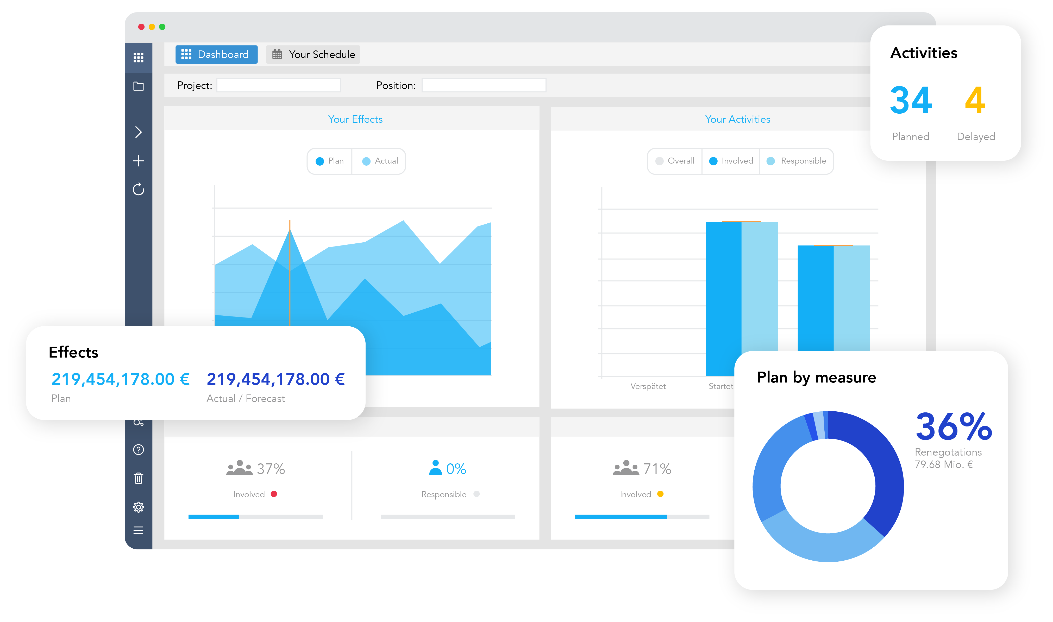
Your schedule in your dashboard with Falcon
If you need to communicate your progress to a client, project sponsor, or other team members, an easy-to-understand status report is the best choice. In addition, real-time dashboards can help you see the current status of your project from multiple views. It can be generated with just a few clicks using the right project portfolio management software and can save you valuable time and energy.
For some time now, Falcon has therefore been offering our users a structured and simple one-click reporting in PowerPoint. Classic management presentations can be created at the touch of a button - filterable and in the desired CI. In order to offer consultants, PMOs, investors and CEOs even more flexible, individual and interactive reporting options, we have enabled the native connection of Falcon to Microsoft Power BI. This means that data from Falcon automatically flows to Power BI, where it is permanently available in real time and up-to-date - without regular and inconvenient imports. With the available data, you can then create individual dashboards and analyses in Power BI according to your preferences and CI.
Project portfolio management with Falcon
The Falcon project portfolio management software developed by us includes schedules, dashboards, and status reports and is therefore perfectly equipped to manage even large projects with many tasks in a clear way. Falcon provides a simple overview of the project portfolio, goals, and progress. You have all information in one place and can access it from anywhere.
I would like to test Falcon by myself!
Please introduce Falcon to me personally!